Introduction – When “Good Content” Isn’t Enough
Sarah stares at her analytics dashboard for what feels like the hundredth time this month. The numbers don’t lie, but they’re telling a confusing story. Traffic is up. Rankings are solid. She’s publishing twice a week like clockwork, and the content is genuinely good—researched, optimized, helpful.
So why aren’t people converting?
The demo request form sits there, mostly ignored. Newsletter signups trickle in at a disappointing rate. Time on page looks decent at first glance, but when she digs deeper, most visitors are bouncing after scanning just the first few paragraphs. Her latest in-depth guide, which took two weeks to research and write, has a conversion rate of 0.8%.
As a Content Marketing Manager, Sarah knows she’s judged on results, not effort. Leadership isn’t interested in hearing about keyword rankings when the sales pipeline remains thin. At the last quarterly review, the question came up: “Is content really working? Should we redirect this budget elsewhere?”
She knows something’s broken, but what?
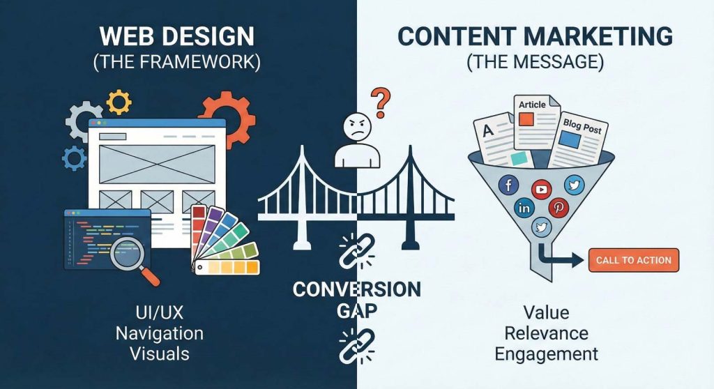
Here’s what Sarah is starting to realize—and what this article will show you: it’s not just about what you publish. It’s about how it’s presented. Your content might be excellent, but if your web design is working against you, those words will never reach their full potential.
The truth is, web design and content marketing aren’t separate disciplines. They’re two sides of the same coin, and when they’re misaligned, even your best content will underperform. This article will show you exactly how design elements boost or sabotage content performance, and more importantly, what you can do about it—even if you’re not a designer.
Who This Is For (Meet “Sarah,” the Reader)
This article is written for content marketers like Sarah—professionals who live in the middle ground between strategy and execution. You’ve got three to six years of experience under your belt. You’re probably in a B2B company, managing content strategy, creating pieces yourself or overseeing freelancers, and reporting results to people who want to see business impact, not just blog stats.
You collaborate with design and dev teams, but you’re not a designer or developer yourself. You speak content fluently, but when it comes to UX terminology and technical implementation, you sometimes feel lost in translation.
Your goals are clear: improve engagement metrics like time on page, scroll depth, click-through rates, and ultimately, conversion rates. You want to be seen as strategic, someone who understands the full funnel and how content drives business results—not just someone who publishes blog posts on schedule.
But here’s what keeps you up at night: your content performs well in search, but conversions are disappointing. Your website feels cluttered or dated. CTAs seem to disappear into the background. And when you suggest design improvements, the dev team pushes back with “that’s not a priority right now.”
If any of this sounds familiar, you’re in the right place. This article won’t drown you in UX jargon or require you to become a designer. Instead, it’ll give you practical, data-aware insights you can apply immediately—and use to build a compelling case for the changes your content needs.
The Hidden Link Between Web Design & Content Performance
Design as the Container, Content as the Message
Think of web design as the container and your content as the message inside. You can craft the most compelling message in the world, but if the container is broken, leaking, or impossible to open, that message will never land.
Web design controls how content is experienced at every level. Can users find your content in the first place? Once they land on a page, does the layout make them want to read—or does it trigger an instant tab-close reflex? After they’ve read (or scanned) your content, do they know what to do next? Is the path forward clear, or are they left wondering, “Okay, now what?”
These aren’t abstract questions. They directly impact the metrics you’re measured on:
Bounce rate tells you how many people land on your page and immediately leave. High bounce rates on content pages often signal design problems—confusing layouts, overwhelming visuals, or unclear value propositions.
Time on page and scroll depth reveal whether people are actually consuming your content. If visitors spend eight seconds on your 2,000-word guide, the problem usually isn’t the writing—it’s that the page doesn’t invite reading.
Click-through rate on internal links and CTAs shows whether your design successfully guides users to the next step. Low CTRs often mean your calls-to-action are buried, poorly designed, or competing with too many other elements.
Conversion rate is the ultimate test. When everything else looks good but conversions lag, design is often the culprit. Your CTA button might be the wrong color, in the wrong place, or surrounded by so much visual noise that visitors simply don’t see it.
How Design Influences SEO and Discoverability
Here’s something many content marketers don’t realize: design affects SEO, just indirectly. Google doesn’t rank you higher because you have a pretty website. But design choices create ripple effects that search engines absolutely notice and reward.
Good layout and logical navigation improve internal linking, which helps search engines understand your site structure and how content pieces relate to each other. When users can easily discover related content, they visit more pages and spend more time on your site—signals that tell Google your content is valuable.
Fast, mobile-friendly pages aren’t technically ranking factors in the traditional sense, but they might as well be. Google’s mobile-first indexing means your mobile experience is what gets evaluated. Slow-loading pages with terrible mobile layouts frustrate users, causing them to bounce back to search results. Google notices that pattern and adjusts rankings accordingly.
Better engagement metrics act as indirect SEO signals. When people spend more time on your pages, scroll further, and click through to other content, you’re demonstrating that your site provides value. Search engines interpret these behaviors as quality signals. Design improvements that boost engagement can actually improve your search visibility over time.
Symptom Check – Signs Your Web Design Is Sabotaging Good Content
Let’s do a reality check. Open your analytics right now—seriously, pull up Google Analytics or whatever platform you use. Look at one of your high-ranking blog posts or a landing page you’re proud of. Now check these symptoms:
High bounce rate despite good rankings. You’re showing up on page one for your target keyword, traffic is coming in, but 70% of visitors leave without clicking anything. This screams design or relevance mismatch. Either the page doesn’t look like what they expected, or the layout is so off-putting they don’t even try to engage.
Shallow scroll depth. Your analytics show that most visitors scroll only 25-50% down the page. You poured valuable insights into the bottom half of that article, but nobody’s seeing them because the top half didn’t compel them to continue. This often happens when content lacks visual hierarchy or scannable structure.
Invisible CTAs. You have calls-to-action on your pages—you know you do because you placed them there—but click-through rates are in the low single digits. When CTAs are poorly designed, positioned awkwardly, or blend into the background, they become functionally invisible.
One-and-done sessions. Visitors land on a blog post and then leave your site entirely. They’re not clicking related posts, not exploring your navigation, not moving deeper into your content ecosystem. This suggests poor internal linking, weak navigation design, or no clear next steps.
Sales feedback about lead quality. Your sales team complains that leads “aren’t warmed up enough” or “don’t understand what we do.” This can happen when your website design doesn’t support a coherent buyer journey, leaving people to jump straight from awareness-stage content to a demo request without proper nurturing.
Do any of these hurt to read because they’re so familiar? Good. That means you’re being honest about what’s happening. And here’s the encouraging part: these are fixable problems. You don’t need to scrap your content and start over. You need to fix how that content is being presented.
Design Element #1 – Information Architecture & Navigation
How Site Structure Affects Content Discovery
Let’s talk about navigation, which sounds boring but is actually one of the highest-leverage design elements you can improve. Clear navigation doesn’t just help users find their way around—it fundamentally changes how much value they extract from your content.
Think about the last time you visited a website with confusing navigation. You probably felt lost, frustrated, and left quickly. That’s exactly what’s happening to your visitors when your site structure doesn’t make sense.
Good navigation helps users find related content instead of just consuming one piece and leaving. When someone reads your blog post about email deliverability, they should easily discover your guide on list segmentation, your case study on a successful campaign, and your comparison of email platforms. Each piece builds on the others, moving prospects further along their journey.
The key is organizing navigation by problems, not by your internal department structure. Your visitors don’t care that your company is divided into “Solutions,” “Services,” and “Platform.” They care about solving problems: “How do I generate more leads?” or “Why is my conversion rate terrible?”
Blog categories and tags should align with your content pillars, not just be random labels. If you have a content pillar around “conversion rate optimization,” that should be a clear category with its own hub page, not scattered across tags like “marketing,” “tips,” “CRO,” and “optimization.”
Resource hub pages for key topics create natural destinations that keep users engaged. Instead of hoping people stumble across related content, you create intentional pathways. A hub page on “Content Marketing Strategy” might link to your beginner’s guide, your advanced tactics post, your tools comparison, and your case studies—all in one place.
Internal Linking & Content Journeys
Internal linking is where design and content strategy intersect beautifully. The right design elements make internal linking feel natural and helpful rather than aggressive or salesy.
A “related posts” section at the end of articles is table stakes, but make sure it’s actually showing related content, not just your three most recent posts. Smart related post plugins or manual curation can dramatically improve engagement.
“Next step” links are even more powerful. These guide users through intentional content journeys: from an awareness-stage blog post to a consideration-stage comparison guide to a decision-stage demo page. Each piece naturally leads to the next, supporting the buyer’s journey without being pushy.
Design elements like breadcrumbs help users understand where they are in your site hierarchy. A breadcrumb trail like “Home > Resources > Blog > Content Marketing” gives context and provides easy navigation back to broader sections.
Sidebars, when used thoughtfully, can orient users and provide quick access to related resources. The key word is “thoughtfully”—cluttered sidebars full of random widgets do more harm than good. A clean sidebar with your best resources, a newsletter signup, and maybe a high-value content offer can significantly boost engagement.
Design Element #2 – Layout, Visual Hierarchy & Whitespace
Making Content Instantly Scannable
Here’s an uncomfortable truth: most people don’t read your content word-for-word. They scan. They’re looking for signals that tell them whether this page is worth their time and where the valuable information lives.
If your layout doesn’t support scanning, you lose readers before they even start reading.
Visual hierarchy is what makes scanning possible. It’s the difference between a wall of text that all looks the same and a page where headings, subheadings, and key points jump out at the reader. When someone lands on your page, they should be able to grasp the structure and main points in seconds.
Clear H1, H2, and H3 structure isn’t just good for SEO—it creates a roadmap for readers. Your H1 tells them what the page is about. H2s break the content into major sections. H3s divide those sections into digestible chunks. This hierarchy guides the eye and makes it easy to jump to relevant sections.
Short paragraphs and bullet lists accommodate how people actually read online. Dense paragraphs that stretch for eight or ten lines are intimidating. Breaking thoughts into shorter paragraphs (two to four sentences) and using bullet lists for multiple points makes content feel approachable.
Pull quotes, highlight boxes, and summary sections give scanners what they need. Someone who’s quickly scrolling should encounter bolded key takeaways, highlighted statistics, or summary boxes that capture the essence of a section. These elements serve as “rest stops” that draw the eye and convey important information even during a quick scan.
Font size, bold text, and spacing all contribute to visual hierarchy. Important concepts should stand out through strategic use of bold (not excessive, but purposeful). Proper spacing between sections gives readers mental breathing room and signals transitions.
Whitespace as a Performance Tool, Not “Empty Space”
When Sarah first hears about “whitespace,” she sometimes thinks it’s a waste of space. “Couldn’t I fit more content there?” The answer is yes, technically. But should you? Absolutely not.
Whitespace—the empty space around text, images, and other elements—is one of the most powerful design tools for improving content performance. It reduces cognitive load, makes content easier to process, and creates a sense of quality and professionalism.
Think about the difference between a crowded, chaotic page and a clean, spacious one. The crowded page makes you work harder to process information. Your brain has to filter out noise and competition for attention. The clean page guides your eye naturally from one element to the next.
Cluttered layouts increase cognitive load and trigger early exits. When visitors feel overwhelmed, they leave. It’s that simple. Generous margins, padding around text blocks, and space between sections make content feel less demanding and more inviting.
Whitespace also conveys trust and authority. Premium brands use lots of whitespace because it signals quality and confidence. Cramped, packed layouts often feel cheap or spammy, even if the content itself is excellent. If you want your content to be perceived as trustworthy and authoritative, give it room to breathe.
Design Element #3 – Typography & Readability
Typography sounds like a designer’s concern, not a content marketer’s. But poor typography is one of the fastest ways to kill content performance, and basic typography improvements are among the easiest wins you can get.
Let’s start with font size. Body text should be at least 16 pixels, preferably larger. Tiny 12px or 14px fonts might look sleek on a designer’s large monitor, but they’re torture to read, especially on mobile devices. When people have to squint or zoom to read your content, they usually just leave instead.
Line length matters more than most people realize. Text that stretches across the full width of a large screen is exhausting to read. Your eye has to travel too far from the end of one line to the beginning of the next, making you lose your place. Optimal line length is generally 50-75 characters per line. This is why many well-designed sites constrain content width, leaving margins on either side.
Line height and paragraph spacing create rhythm and readability. Lines that are too close together feel cramped and difficult to follow. A line height of about 1.5 times the font size is generally comfortable. Space between paragraphs should be enough to signal a break without creating jarring gaps.
Contrast is non-negotiable. Dark text on a light background (or light text on a dark background) with strong contrast is easy to read. Low-contrast combinations might look stylish—gray text on a slightly lighter gray background, for instance—but they’re unreadable for many people and frustrating for everyone.
Avoid trendy but problematic choices like light gray text on white backgrounds, text over complex background images, or ultra-thin font weights that disappear on certain screens. These design choices might win awards, but they kill readability and tank your content performance.
Here’s the connection to your metrics: better readability means longer time on page. When content is comfortable to read, people read more of it. They scroll deeper, spend more time engaged, and are more likely to reach your CTAs. Typography improvements might seem minor, but they compound into significant performance gains.
Design Element #4 – Branding, Trust & Perception
Consistent branding isn’t just about looking professional (though that matters too). It’s about building trust, credibility, and recognition—all things that directly impact whether people engage with your content and take action.
When someone lands on your site, they make snap judgments in milliseconds. Does this look legitimate? Can I trust this company? Is this content worth my time? Visual design plays a huge role in those instant assessments.
Consistent colors, button styles, imagery, and tone across your site signal professionalism and attention to detail. When every page looks different—different color schemes, different button styles, different layouts—visitors subconsciously register this as unprofessional or disorganized, even if they don’t consciously notice the inconsistencies.
Trust factors matter enormously in content marketing. A polished, professional design makes your content more credible, even if the actual information is identical to what a worse-designed competitor offers. People assume that companies with professional-looking websites have better products and services. This is called the “halo effect,” and it’s powerful.
Consistent layouts across blog posts and landing pages create familiarity. After visitors read a couple of your posts, they should know where to expect the CTA, where related posts live, and how your content is structured. This familiarity reduces friction and makes it easier for them to engage repeatedly.
For Sarah specifically, strong, consistent branding helps her look more strategic internally. When leadership sees cohesive, professional content experiences, they’re more likely to view content marketing as a strategic function rather than “just blogging.” This perception difference can directly impact budget, resources, and Sarah’s seat at the decision-making table.
Design Element #5 – CTAs, Conversion Paths & Lead Gen
Where CTAs Live in a Content-First Website
Let’s be blunt: if you’re not converting readers into leads, your content marketing isn’t working. And the single biggest factor in conversions—assuming your offer is relevant—is CTA design and placement.
Most content marketers understand they need CTAs. But where should those CTAs live? How many is too many? What types work best in different contexts?
Above the fold (hero section) is prime real estate, but it needs to be done right. If someone lands on a blog post and immediately sees an aggressive “Book a Demo” CTA before they’ve read anything, it feels pushy. A softer CTA here might work better—something like “Subscribe to get our best content” or a content upgrade relevant to the post.
In-line CTAs in the middle of the post catch people when they’re engaged. If someone has scrolled 40% through your article, they’re invested. That’s a great moment to offer a relevant resource: “Want our complete guide to this topic? Download the checklist here.”
End-of-post CTAs are expected and effective. By the time readers reach the end, they’ve consumed your content and decided whether you’re credible. This is your chance to move them to the next stage: a demo request, a newsletter signup, a related guide, or whatever makes sense for that content piece.
Sticky bars or sidebars can work if they’re not annoying. A persistent but unobtrusive CTA that stays visible as users scroll can capture attention without disrupting the reading experience. The key is making sure it doesn’t cover content or feel aggressive.
Types of CTAs for Different Stages
Not all CTAs should push for a demo or sale. Matching CTA intensity to content stage is crucial:
Soft CTAs work for early-stage, awareness content: newsletter signups, blog subscriptions, social media follows, related articles. These ask for minimal commitment and keep people in your ecosystem.
Medium CTAs suit mid-funnel, consideration content: webinar registrations, checklist downloads, email courses, templates, tools, or calculators. These provide value in exchange for contact information, helping you build your list with interested prospects.
Hard CTAs belong on bottom-funnel, decision content: demo requests, free trials, consultation bookings, pricing inquiries. These make sense when someone has consumed substantial content and is clearly evaluating solutions.
Putting hard CTAs on every piece of awareness content is a mistake. It’s like proposing marriage on the first date—too much, too soon. Design your CTA strategy to match the buyer’s journey.
CTA Design & Microcopy
Even perfectly placed CTAs fail if they’re poorly designed or badly worded.
Design aspects that matter:
Size and shape signal importance. Your primary CTA should be larger and more prominent than secondary actions. Buttons should be big enough to easily tap on mobile devices.
Color contrast makes CTAs visible. Your button should stand out from the surrounding content without clashing horribly with your brand. Many sites use a bright accent color exclusively for CTAs to make them instantly recognizable.
Surrounding whitespace prevents CTAs from getting lost in visual clutter. Give your button breathing room. Don’t crowd it with competing elements.
Microcopy principles:
Action-oriented language tells people exactly what will happen: “Download the Guide,” “Start Your Free Trial,” “Get the Checklist.” Vague buttons like “Submit” or “Learn More” perform worse.
Benefit-led copy focuses on what the user gets: “Get Weekly Marketing Tips” is better than “Subscribe to Newsletter.” You’re selling the benefit, not just the action.
Specificity reduces anxiety: “Book a 15-Minute Demo” feels less intimidating than “Talk to Sales.”
Forms & Friction
Great CTAs can be destroyed by terrible form design. If someone clicks your beautifully designed CTA button and then encounters a form asking for their life story, you’ve lost them.
Bad form design kills conversions:
Too many fields signal that you value your data more than their time. Every additional field you add drops your conversion rate. Stick to what you actually need—name and email for most content offers, maybe company and role for higher-value gated content.
Unclear labels create confusion. If someone has to guess what you’re asking for, some will just leave. Use clear, specific labels and help text where needed.
No mobile optimization is inexcusable. Forms that are difficult to fill out on mobile devices lose huge numbers of potential conversions.
Quick wins for better forms:
Reduce fields to the bare minimum. You can always ask for more information later through progressive profiling or email follow-up.
Add social proof near forms: testimonials, trust badges, or simple statements like “Join 10,000 marketers who get our weekly insights.”
Optimize for mobile: use appropriate input types (email keyboards for email fields, number keyboards for phone fields), make buttons large enough to tap easily, and test the entire flow on an actual phone.
Design Element #6 – Imagery, Visuals & Media
Text-only content is hard to scan, hard to engage with, and frankly, a bit boring. Strategic use of images, diagrams, and other visual media makes content more engaging, more understandable, and more shareable.
Images serve multiple purposes in content:
Breaking up text walls makes content less intimidating. Even generic but relevant images create visual rest stops that make long articles feel more approachable.
Explaining complex ideas is often easier with visuals than text alone. Diagrams, infographics, flowcharts, and annotated screenshots can communicate in seconds what might take paragraphs to explain.
Supporting brand identity through consistent visual style makes your content memorable and professional.
Smart visual choices:
Annotated screenshots are incredibly valuable for how-to content. Don’t just show a screenshot—add arrows, highlights, and text annotations to guide the viewer’s eye to what matters.
Comparison tables help readers evaluate options at a glance. Instead of making people read through paragraphs comparing features, a well-designed table does the work instantly.
Simple diagrams and illustrations can clarify processes, relationships, or concepts. They don’t need to be fancy—even basic diagrams add tremendous value.
Charts and graphs make data digestible. If you’re citing statistics or research, visual representations help readers grasp the significance faster.
Critical caution:
Unoptimized images kill page speed. A beautiful 5MB hero image might look great, but if it takes eight seconds to load, most visitors will leave before ever seeing it. Always compress and optimize images before uploading. Modern formats like WebP can dramatically reduce file sizes without visible quality loss.
Avoid purely decorative stock photos that add no value. Random photos of business people shaking hands or someone pointing at a laptop just take up space and slow down your page. Every image should have a purpose.
Design Element #7 – Mobile Experience & Responsive Design
If you’re designing content experiences primarily for desktop, you’re doing it wrong. More than half of web traffic comes from mobile devices, and for many audiences, that number is even higher.
Google uses mobile-first indexing, meaning the mobile version of your site is what gets evaluated for search rankings. A terrible mobile experience doesn’t just frustrate users—it directly hurts your SEO.
Common mobile design failures:
Tiny font sizes force users to zoom and squint. What looks fine on a 27-inch monitor is unreadable on a phone. Text that’s 16px or larger on desktop should scale appropriately for mobile screens.
Squished layouts where elements overlap or get cut off create frustration. Responsive design should adapt layouts for smaller screens, not just shrink everything down.
CTAs out of view or hard to tap mean lost conversions. If your main CTA button is only visible after scrolling through three full screens on mobile, or if it’s too small to accurately tap with a thumb, you’re leaving money on the table.
Difficult navigation—menus that won’t open, dropdowns that don’t work, or navigation hidden behind confusing icons—sends users fleeing to competitors.
Forms that are nightmares on mobile will never convert. Multi-column layouts, dropdown menus that don’t work properly, tiny input fields, and submit buttons that are hard to tap all kill form completion rates.
How to self-audit mobile experience:
Open your highest-traffic content pages on your actual phone—not a desktop browser pretending to be mobile, but your real phone.
Check readability: Can you comfortably read the text without zooming? Is the font size appropriate?
Test scrolling and navigation: Does scrolling feel smooth? Can you easily access the menu? Do internal links work properly?
Evaluate CTA visibility: How many screens do you have to scroll to see the main CTA? Is it large enough to tap accurately?
Try filling out forms: Do input fields work properly? Does the keyboard cover important elements? Can you easily submit?
This five-minute test will reveal more problems than hours of theoretical analysis.
Design Element #8 – Page Speed & Technical UX (Without the Jargon)
Page speed affects everything: user experience, conversions, SEO, and bounce rate. It’s one of those rare factors that impacts nearly every metric you care about.
The simple truth: slow pages lose visitors. Studies consistently show that as page load time increases from one second to three seconds, bounce rate jumps significantly. By five seconds, you’ve lost most mobile visitors.
Speed is both a UX issue and an SEO factor. Users hate waiting, and Google knows that, so page speed influences rankings. Fast sites provide better experiences, and better experiences lead to better business results.
What makes pages slow:
Huge, unoptimized images are the most common culprit. That 8MB header image or gallery of full-resolution photos might look beautiful, but they’re killing your load time.
Too many scripts, plugins, and widgets add overhead. Every tracking pixel, social media embed, chat widget, and marketing tool slows things down. Sometimes dramatically.
Heavy popups and overlays, especially those that load slowly or require additional scripts, delay the page becoming usable.
Practical action steps (non-technical):
Compress images before uploading. Free tools like TinyPNG or built-in compression in image editing software can reduce file sizes by 70% or more with no visible quality loss.
Limit unnecessary plugins and widgets. Audit what’s actually running on your pages. Do you really need five different tracking scripts, three social sharing plugins, and two chatbots? Every element has a cost.
Ask your dev or design team to run basic performance checks using free tools like Google PageSpeed Insights or GTmetrix. These tools provide specific recommendations and benchmark your site against best practices.
Consider lazy loading for images below the fold. This loads images only as users scroll down, making initial page load much faster.
Review third-party scripts. Marketing teams often accumulate scripts and tracking codes over time. Regular audits can identify opportunities to consolidate or remove unnecessary code.
You don’t need to become a developer to improve page speed. These basic improvements can make meaningful differences, and when you need deeper technical work, you’ll be able to make an informed case to your development team.
Design Element #9 – Accessibility That Helps Everyone (Including SEO)
Accessibility might sound like a compliance checkbox, but it’s actually a performance enhancement that benefits all users while also improving SEO.
The business case is simple: accessible design helps everyone, not just people with disabilities. Clear hierarchy, good contrast, and descriptive labels make your content easier for everyone to use. Plus, many accessibility best practices align perfectly with SEO best practices.
Simple accessibility wins with big impact:
Proper heading structure (H1, H2, H3 in logical order) helps screen readers navigate content, but it also helps sighted users scan content and helps search engines understand your content structure. One improvement, multiple benefits.
Alt text on images describes visuals for screen readers, but it also helps with SEO and serves as a fallback when images don’t load. Writing descriptive alt text takes seconds and provides lasting value.
Good color contrast between text and background makes content readable for people with visual impairments, but it also makes content easier for everyone to read, especially in bright sunlight or on lower-quality displays.
Clear focus states for links and buttons help keyboard users navigate, but they also clarify clickable elements for everyone, reducing confusion about what’s interactive.
Descriptive link text (“download the content strategy guide” instead of “click here”) helps screen reader users and improves SEO by providing context about link destinations.
Frame accessibility for leadership:
Accessibility improvements benefit all users, leading to better engagement metrics across the board.
They expand your potential audience by removing barriers.
Many accessibility features directly improve SEO, making them a marketing investment, not just a compliance cost.
Demonstrating commitment to accessibility enhances brand reputation.
You don’t need to become an accessibility expert overnight. Start with these basics, and you’ll improve user experience, SEO, and conversions while doing the right thing.
Applying This: How to Audit Your Website’s Design from a Content Marketer’s Perspective
A 30-60 Minute DIY Content-UX Audit
Reading about design principles is one thing. Applying them to your actual website is where the value lies. Here’s a practical audit you can complete in under an hour that will reveal exactly where your design is helping or hurting your content performance.
Step 1: Choose your pages
Select three high-value content pages. Pick pages that already get decent traffic—maybe your two best-performing blog posts and one important landing page. The goal is to find where design improvements will have the biggest impact.
Step 2: Gather baseline metrics
For each page, note these key metrics from your analytics:
- Bounce rate
- Average time on page
- Pages per session (for visitors who land here)
- Scroll depth (if you track this)
- Conversion rate (form fills, CTA clicks, etc.)
Write these down. These are your “before” numbers that you’ll use to measure improvement after making changes.
Step 3: Manual review
Now open each page in your browser and evaluate it against these design elements:
Navigation & Internal Linking:
- Can I easily find related content from this page?
- Are related posts or resources clearly visible?
- Does the main navigation help me explore relevant topics?
- Are there clear “next step” links?
Layout & Scannability:
- Can I grasp the main points in 10 seconds of scanning?
- Do headings create a clear structure?
- Are paragraphs short and scannable?
- Is there good use of whitespace?
Typography & Readability:
- Is the font size comfortable to read?
- Is there enough contrast between text and background?
- Are line length and line height appropriate?
- Does any text feel cramped or hard to read?
CTA Placement & Clarity:
- How many scroll screens before I see a CTA?
- Are CTAs visually distinct and obvious?
- Is it clear what action to take and why?
- Are there too many competing CTAs?
Mobile Experience:
- Open the page on your actual phone
- Is text readable without zooming?
- Are CTAs visible and tappable?
- Does navigation work smoothly?
- Can you fill out any forms easily?
Page Speed:
- Does the page feel snappy, or do elements load slowly?
- Run it through PageSpeed Insights for a quick benchmark
Accessibility Basics:
- Is heading structure logical (H1 → H2 → H3)?
- Do images have alt text?
- Is text contrast sufficient?
- Are links clearly identifiable?
Step 4: Document findings
Create a simple spreadsheet with three columns:
- Issue: What’s wrong
- Impact: How it’s hurting performance
- Fix: What should change
This becomes your action list and the foundation for your internal case.
Building a Case Internally – How to Talk to Your Boss & Dev/Design Team (Continued)
Presenting a Mini “Before vs. After” Story (Continued)
Use a simple tool like Figma or Canva to sketch improvements, annotate screenshots with notes about changes, or even describe improvements in bullet points with examples from well-designed competitor sites.
Hypothesize expected impact based on research and benchmarks. You don’t need to promise exact numbers, but you can say things like:
“Based on industry research, improving CTA visibility and reducing form fields typically increases conversion rates by 20-40%. Even a conservative 15% improvement would add approximately X demos per month.”
“Sites with better mobile optimization see 25-50% lower bounce rates on mobile traffic. Since 54% of our traffic is mobile, this could significantly impact our overall engagement.”
This approach shows you’re thinking strategically, you’ve done your homework, and you understand the business impact. It’s much more compelling than “I think the design could be better.”
Overcoming Common Objections
Even with a solid case, you’ll face pushback. Here’s how to handle the most common objections:
“This will be expensive.”
Start with low-lift changes that don’t require a full redesign. Many impactful improvements are template tweaks, not ground-up rebuilds. Suggest a phased approach:
Phase 1: Typography updates, CTA redesign, and form optimization (minimal dev time) Phase 2: Layout improvements to blog template (moderate effort) Phase 3: Navigation restructure and hub page creation (larger project)
This shows you’re realistic about resources and willing to prove value before asking for bigger investments.
“We don’t have time right now.”
Reframe time as an investment, not a cost. Point out that you’re already spending time and money creating content that’s underperforming. Small design adjustments can multiply the return on that existing investment.
“We’ve published 80 blog posts this year. Each one gets traffic but converts poorly. If we spend two weeks improving the template, every single one of those posts—and every future post—performs better. That’s not ‘finding time,’ that’s making our existing work more valuable.”
Also emphasize that continuing with poor design means you’ll need to create more content to hit the same goals. Better design reduces the content volume needed to achieve results.
“Is content really the problem, or is it something else?”
This is where your data becomes crucial. Show that content is doing its job—ranking well, attracting traffic—but the design is where the drop-off happens:
“Our blog posts rank in the top 3 for target keywords and drive steady traffic. Bounce rate and conversion rate are the issues. People are finding us; they’re just not engaging once they arrive. That’s a presentation problem, not a content problem.”
You can also point to specific examples: “This post on [topic] gets 2,000 visits per month but only converts at 0.6%. If our design better supported the content, even a modest improvement to 1.5% would triple the leads from this single page.”
Low-Lift Design Improvements You Can Make Without a Full Redesign
The good news: you don’t need to wait for a complete website overhaul to see improvements. There are specific, high-impact changes you can implement relatively quickly—some you might even be able to do yourself or with minimal dev support.
Here are the quick wins Sarah can pursue:
Reformat existing high-traffic posts
Go into your top 10 traffic-driving blog posts and improve their structure. Break long paragraphs into shorter ones. Add more subheadings. Insert bullet lists where you’re listing multiple points. Add pull quotes or highlight boxes around key statistics or takeaways. Many content management systems let you do this without any coding.
Time investment: 30-45 minutes per post Potential impact: Improved scroll depth and time on page
Add clear CTAs to top-performing content
If your high-traffic posts don’t have prominent, relevant CTAs, add them. Place one near the top (a soft offer like a newsletter), one mid-content (a relevant resource), and one at the end (whatever makes sense for that stage of the journey). Make sure these CTAs stand out visually and use clear, benefit-driven copy.
Time investment: 15-20 minutes per post Potential impact: Immediate increase in conversion opportunities
Implement “related posts” or “next step” modules
If you don’t have automated related posts, set them up. Better yet, manually curate “next step” recommendations for your most important content. Create a simple template that suggests 2-3 specific next reads based on the buyer journey.
Time investment: Initial setup plus 10 minutes per key post Potential impact: Lower bounce rate, higher pages per session
Improve font size and line spacing in your blog template
If your font is smaller than 16px or your line height is cramped, update your blog template. This is often a simple CSS change that your dev team can implement in under an hour. The impact is immediate and applies to all your content automatically.
Time investment: 30-60 minutes (with dev support) Potential impact: Better readability across all content
Remove or reduce disruptive popups
If you have aggressive popups that appear immediately on page load, dial them back. Set them to appear after 30 seconds or after someone has scrolled 50% of the page. Or use exit-intent popups instead. This reduces frustration while still capturing email addresses from interested visitors.
Time investment: 15-30 minutes to adjust settings Potential impact: Reduced bounce rate, better user experience
Optimize your top 5 landing pages for mobile
Pick your five most important landing pages and audit them thoroughly on mobile. Fix any obvious issues: increase tap target sizes for buttons, ensure forms work smoothly, check that text is readable, remove any elements that break the layout. Sometimes these are quick CSS fixes.
Time investment: 1-2 hours per page (depending on issues) Potential impact: Dramatically improved mobile conversion rates
Create a simple internal linking strategy
Develop a spreadsheet mapping your content to buyer journey stages and topics. Then systematically add 2-3 internal links to each post, pointing to relevant next-step content. This helps with both SEO and user navigation.
Time investment: 2-3 hours for strategy, 10 minutes per post for implementation Potential impact: Better content discovery, improved SEO
Position this as a “Content Performance Boost” project you can propose and lead. Frame it as a 1-2 week focused initiative that doesn’t require major resources but promises measurable improvements. Track before-and-after metrics for the pages you optimize, and use those results to build the case for more comprehensive changes.
The beauty of this approach is that it proves your hypothesis. If these small changes move the needle, you’ve demonstrated that design improvements work, making it much easier to secure buy-in for larger initiatives.
Advanced Alignment – Designing for Content Pillars & Buyer Journey
Once you’ve made initial improvements and proven their value, you can level up by aligning design and content strategy more systematically. This is where Sarah transforms from “the blog person” into a full-funnel strategist.
Create dedicated hub pages for key topics
If you have content pillars—major topics your content strategy revolves around—each one deserves a dedicated hub page. Think of these as curated resource centers that organize all related content in one place.
A hub page for “Email Marketing” might include:
- An overview of your email marketing perspective and approach
- Links to beginner, intermediate, and advanced guides
- Case studies demonstrating results
- Tool comparisons and recommendations
- Templates and resources visitors can download
These hub pages serve multiple purposes: they’re great for SEO (comprehensive, link-rich pages), excellent for user experience (helping people find exactly what they need), and powerful for conversions (guiding people through a logical journey).
The design of hub pages should be intentional, not just a list of links. Use cards or sections to group content by type or experience level. Include brief descriptions so visitors know what each piece offers. Make it visually clear and easy to navigate.
Design consistent templates for different content types
Not all content should look the same, but content of the same type should be consistent. Create (or advocate for) distinct but consistent templates for:
- Blog posts: Standard article format with clear structure
- Guides and long-form content: More visual, with table of contents, section navigation
- Comparison pages: Tables, pros/cons sections, clear CTAs
- Case studies: Consistent structure highlighting challenge, solution, results
- Landing pages: Focused design with minimal navigation and prominent CTAs
When visitors encounter consistent patterns, they learn how to navigate your content more efficiently. They know where to expect certain information, where CTAs typically appear, and how different content types serve different purposes.
Map CTAs to funnel stages
This is where content strategy and design come together beautifully. Every piece of content exists somewhere in the buyer journey, and your CTAs should reflect that position.
Top-of-funnel awareness content (broad, educational blog posts):
- Soft CTAs: newsletter signup, related articles, educational resources
- Goal: Keep them in your ecosystem and build familiarity
Middle-of-funnel consideration content (comparison guides, how-to resources):
- Medium CTAs: webinar registration, comprehensive guides, tools, templates
- Goal: Capture contact information and demonstrate expertise
Bottom-of-funnel decision content (product pages, case studies, ROI calculators):
- Hard CTAs: demo requests, free trials, consultations, pricing conversations
- Goal: Convert qualified prospects into sales opportunities
When you map this out visually and share it with your team, it demonstrates sophisticated strategic thinking. You’re not just publishing content—you’re orchestrating journeys.
Use design to reinforce content relationships
Smart design can make content relationships visible and encourage progression through your funnel. Some techniques:
- Progressive disclosure: Start with high-level content and progressively reveal more detailed, advanced content as visitors engage
- Visual journey maps: Show visitors where they are in learning about a topic and what comes next
- Breadcrumbs and progress indicators: Help people understand context and track their exploration
- Related content modules that specifically suggest “next level” content, not just similar topics
This level of alignment requires collaboration between content, design, and development teams. But when it works, it creates seamless experiences that feel guided rather than random, strategic rather than chaotic.
For Sarah, implementing this advanced alignment positions her as someone who thinks about the entire customer experience, not just individual content pieces. It’s the difference between being seen as a tactical executor and a strategic driver of business results.
Optional Case Study: When Design Changes Transform Content Performance
Let’s look at a real-world example that illustrates everything we’ve discussed. (While this is a composite based on multiple real situations, the patterns and results are typical.)
The Company: TechFlow Analytics
TechFlow Analytics is a B2B SaaS company selling data visualization tools. Their content marketing manager, similar to Sarah, had been publishing consistently for 18 months. They had:
- 120+ blog posts ranking well for relevant keywords
- 15,000 monthly organic visitors
- Decent engagement metrics (3-minute average time on page)
- But disappointingly low conversion rates: 0.5% on content pages
The Symptoms
When they dug into the data, patterns emerged:
- High bounce rate on mobile (72%) versus desktop (51%)
- Most users scrolled only 40% of blog posts
- CTA clicks were rare—even on bottom-of-funnel content
- Demo request rate from content was flat despite growing traffic
- Sales team feedback: “Leads don’t seem to understand what we do”
The Diagnosis
A content-UX audit revealed several issues:
Design problems:
- Blog template used 14px font—barely readable, especially on mobile
- CTA buttons were small, low-contrast, and appeared only at the very end of posts
- No clear internal linking or content progression
- Mobile layout was broken in several places
- Navigation was organized by company structure, not customer problems
- Forms requested 8 fields for basic content downloads
Content was strong, but design was undermining it at every turn.
The Changes
TechFlow made changes in two phases:
Phase 1 (Quick Wins – 2 weeks):
- Increased font size to 18px with better line spacing
- Redesigned CTA buttons with higher contrast and clearer copy
- Added inline CTAs midway through top 20 posts
- Reduced form fields from 8 to 3 for content downloads
- Fixed mobile layout issues
- Added related posts modules
Phase 2 (Strategic Improvements – 6 weeks):
- Created hub pages for their 4 content pillars
- Restructured navigation around customer problems
- Designed distinct templates for different content types
- Implemented a clear content progression strategy with mapped CTAs
- Added comparison tables and visual elements to key posts
- Optimized images and improved page speed
The Results
After 3 months, the changes delivered measurable improvements:
Engagement metrics:
- Bounce rate dropped from 65% to 48% overall
- Mobile bounce rate dropped from 72% to 52%
- Average scroll depth increased from 40% to 67%
- Time on page increased from 3:12 to 4:38
- Pages per session increased from 1.4 to 2.3
Conversion metrics:
- Overall conversion rate increased from 0.5% to 1.8%
- Demo requests from content increased by 220%
- Newsletter signups increased by 140%
- Resource downloads increased by 185%
Business impact:
- 35% of new closed deals attributed to content touchpoints (up from 18%)
- Sales cycle shortened by approximately 2 weeks for content-engaged leads
- Marketing cost per lead decreased by 31%
The Lessons
What made this transformation work wasn’t that TechFlow created more content. They improved how existing content was experienced. The writing didn’t change. The information didn’t change. But the presentation changed everything.
The content marketing manager went from defending the content budget to getting additional resources and being invited to strategic planning meetings. When design and content work together, the results speak for themselves.
Your situation might be different, but the principle remains: good content needs good design to deliver results.
Conclusion – You Don’t Need More Content; You Need Better Experiences
If you’re reading this because your content isn’t converting the way you hoped, take a breath. The problem probably isn’t that your writing is bad or that your topics are wrong. It’s that the design—the container for your content—isn’t supporting what you’re trying to accomplish.
Think about what we’ve covered:
Web design controls how content is discovered, consumed, and acted upon. From navigation to typography, from CTAs to mobile experience, design decisions directly impact every metric you’re measured on. Information architecture determines whether visitors find related content or leave after one post. Layout and visual hierarchy decide whether people scan your content or bounce immediately. Typography and readability affect how much of your carefully crafted content actually gets read.
Branding and trust signals influence whether people believe your content and see you as credible. CTA design and placement determine whether engaged readers know what to do next. Imagery and media make complex ideas clearer and content more engaging. Mobile experience and page speed affect more than half your audience—probably more. And accessibility improvements help everyone while boosting SEO.
Here’s the truth Sarah needs to hear, and maybe you do too: You don’t need to publish more. You need to make what you’ve already published work harder. Every blog post you’ve written, every guide you’ve created, every case study you’ve published—they all get better when design stops sabotaging them and starts supporting them.
The encouraging part? Many of these fixes don’t require a complete redesign or a massive budget. You can start small: audit a few key pages, implement quick wins, measure the results, and build from there. Prove the concept with low-lift changes, then use those results to advocate for more comprehensive improvements.
You also don’t need to become a designer. You just need to understand how design impacts content performance and learn to speak the language that gets design and dev teams to prioritize your needs. Frame issues as business opportunities. Show data. Propose specific, reasonable changes. Make it easy to say yes.
And remember: when you improve how content is presented, you’re not just boosting metrics. You’re making it easier for the right people to find what they need, understand your value, and take the next step. That’s what content marketing is supposed to do.
Your Next Steps
You’ve got three options from here:
Option 1: Do the audit Set aside an hour this week to audit 2-3 of your highest-traffic content pages using the framework we outlined. Document specific issues, connect them to business impact, and identify 3-5 quick wins you could implement in the next two weeks. This costs you nothing but time and gives you concrete data to work with.
Option 2: Start with one quick win Pick the easiest, highest-impact change from the list of low-lift improvements. Maybe it’s reformatting your top 10 blog posts for better scannability, or adding clear CTAs to high-traffic pages, or fixing mobile layout issues. Do it, measure the before-and-after, and use those results to justify the next improvement.
Option 3: Build your case If you need buy-in before you can make changes, use this article as a starting point. Create a simple presentation showing:
- Current content performance (traffic vs. conversions)
- Specific design issues you’ve identified
- Expected business impact of improvements
- A phased approach starting with quick wins
- Comparable examples or benchmarks
Then schedule time with your boss, the design team, or whoever needs to approve resources.
Whatever you choose, do something. Your content deserves better than to be buried under poor design. You deserve to see the results your hard work should be generating. And your company deserves the leads and customers that better content experiences will deliver.
The question isn’t whether design impacts content performance—we’ve seen that it absolutely does. The question is what you’re going to do about it.
Start small. Measure everything. Prove the value. Then scale what works.
Your content is already good. Now make sure people can actually experience it the way you intended.

