You’ve seen them everywhere. That sliding banner on your favorite e-commerce site. The rotating testimonials on a service page. Those auto-advancing product images that seem to have a mind of their own. Welcome to the world of web carousels—one of the most debated elements in modern web design.
If you’re a beginner web designer, marketer, or website manager, understanding carousels isn’t just about knowing what they are. It’s about knowing when to use them, how to implement them properly, and most importantly, when to avoid them altogether. Because here’s the thing: carousels can either enhance your website’s user experience or completely tank your conversion rates.
In this guide, we’re cutting through the noise. You’ll learn what carousels actually are, why designers love (and sometimes hate) them, and how to implement them in a way that doesn’t frustrate your visitors. We’ll explore real-world examples, discuss common pitfalls, and give you practical best practices you can apply immediately.
Whether you’re building your first website or managing content for an established brand, this guide will help you make informed decisions about carousels. Let’s dive in and figure out if these sliding elements deserve a place on your site.
What Is a Carousel in Web Design?
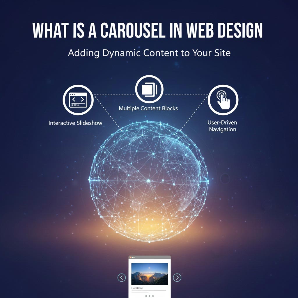
A carousel (also called a slider or image rotator) is an interactive web component that cycles through multiple pieces of content in the same screen space. Think of it as a digital slideshow that rotates through images, text, videos, or a combination of all three.
Here’s the technical bit made simple: carousels use JavaScript and CSS to transition between different content panels, usually with navigation arrows, dot indicators, or automatic advancement. Users can typically click through slides manually or watch them rotate automatically.
Now, you might hear these terms used interchangeably, but there are subtle differences:
Carousel: The broad term for any rotating content display, often with multiple visible items (like Netflix’s movie rows).
Slider: Usually refers to full-width rotating banners where only one slide shows at a time.
Image Rotator: Specifically focuses on cycling through images rather than mixed content.
For practical purposes, most people use these terms interchangeably, and that’s perfectly fine.
Carousels commonly showcase various types of content. E-commerce sites use them to highlight featured products or ongoing sales. Service websites rotate customer testimonials to build trust. News sites cycle through top stories. Portfolio sites display project samples. Marketing teams love them for promoting multiple campaigns without cluttering the homepage.
The mechanics are straightforward. Content sits in panels that slide, fade, or transition horizontally or vertically. Navigation controls let users jump to specific slides. Some carousels pause on hover, while others keep rotating regardless of user interaction.
You’ve definitely encountered carousels on major websites. Amazon uses them extensively for product recommendations. Apple showcases new products with sleek, minimal sliders. Target rotates promotional banners on their homepage. These companies invest millions in UX research, so their use of carousels isn’t accidental—it’s strategic.
The Purpose of Carousels in Web Design
So why do designers keep reaching for carousels despite all the controversy surrounding them? The answer lies in both practical needs and visual appeal.
The primary driver is simple: limited screen real estate. Your homepage has only so much above-the-fold space, but your marketing team wants to promote five different campaigns. Your product manager insists on featuring eight categories. Your CEO demands prominent placement for that new partnership announcement. A carousel seems like the perfect compromise—everyone gets their spot in the rotation.
This space-saving quality makes carousels particularly attractive for highlighting promotions or featured content. Instead of choosing which sale to promote, you can showcase all of them. Rather than picking one testimonial, you can rotate through your most compelling customer stories. It’s the “have your cake and eat it too” solution that appeals to stakeholders with competing priorities.
Carousels also excel at visual storytelling. A well-designed carousel can guide users through a narrative, showing before-and-after transformations, step-by-step processes, or the evolution of a product line. Fashion brands use them to showcase outfit combinations. Travel sites use them to transport visitors through destination experiences. Tech companies use them to demonstrate product features in sequence.
From a user experience perspective, carousels serve specific functions. They add movement to otherwise static pages, catching the eye and breaking up text-heavy sections. They signal that there’s more content to explore, encouraging interaction. When implemented thoughtfully, they create a sense of discovery as users click through to find what interests them.
Carousels work best in particular situations. Product galleries benefit from carousel functionality, letting users browse without leaving the page. Portfolio showcases gain from the ability to display multiple projects compactly. Testimonial sections feel more dynamic when rotating through customer voices. Image-heavy content, like real estate listings or vacation rentals, becomes more manageable.
The key is balancing visual appeal with actual functionality. A carousel should enhance the user experience, not exist solely because it looks modern or trendy. The best implementations serve a genuine purpose—they help users accomplish their goals faster or make decisions more confidently.
Advantages of Using a Carousel
Let’s talk about what carousels do well. Despite their critics, these elements offer legitimate benefits when implemented correctly.
Space efficiency tops the list. A single carousel occupying 600 pixels of screen height can showcase five to ten different pieces of content. Without it, you’d need to stack those elements vertically, pushing important content below the fold or cluttering your layout. For businesses with multiple messages to communicate, this compression is invaluable.
Visibility for multiple offerings increases significantly. Instead of burying secondary products or services deep in your site architecture, a homepage carousel brings them front and center. A boutique hotel can highlight its restaurant, spa, event space, and room options all within the first screen. An agency can showcase different service lines without overwhelming visitors with information.
The dynamic element naturally draws attention. Human eyes are hardwired to notice movement. In a sea of static content, a smoothly transitioning carousel acts as a visual focal point. This isn’t manipulation—it’s understanding basic psychology and using it to guide user attention to important content.
Storytelling and branding opportunities expand. Carousels let you craft a narrative sequence. A fitness app might show: Slide 1 – The problem (feeling unmotivated), Slide 2 – The solution (personalized workouts), Slide 3 – The result (achieving goals), Slide 4 – Social proof (user testimonials), Slide 5 – The call-to-action (start your free trial). This sequential storytelling feels more natural than presenting everything simultaneously.
Engagement potential exists when design is thoughtful. Users who interact with a carousel spend more time on the page, exploring content at their own pace. They’re actively participating rather than passively scrolling. This engagement signals interest and can lead to higher conversion rates—when done right.
Consider successful implementations. Airbnb’s experience carousels let users browse activities without leaving the destination page. IKEA’s room inspiration carousels show products in context across multiple styling approaches. The New York Times uses carousels to surface multiple top stories, giving editors flexibility in content hierarchy.
The benefits are real, but they’re conditional. A carousel succeeds when it serves user needs, loads quickly, displays relevant content, and includes proper controls. The advantages evaporate when implementation is poor or when a carousel exists only to satisfy internal politics.
Disadvantages and Common Pitfalls
Now for the uncomfortable truth: carousels often underperform expectations, and the data backs this up.
User interaction rates are surprisingly low. Studies have shown that only 1% of users actually click on carousel slides, and when they do, 84% of clicks go to the first slide. That means slides two through five in your carefully crafted rotation? They’re essentially invisible. Users develop “banner blindness”—they’ve learned to ignore anything that looks like an ad, and auto-rotating carousels trigger that instinct.
Page load speed takes a hit. Carousels require JavaScript libraries, CSS files, and multiple high-resolution images. Each slide adds to your page weight, and loading five hero images instead of one can significantly slow your site. Google considers page speed a ranking factor, so this performance penalty directly impacts your SEO. Mobile users on slower connections feel this pain most acutely.
Mobile responsiveness becomes complicated. What works beautifully on a 27-inch monitor often fails on a 5-inch smartphone screen. Carousel controls become tiny and hard to tap. Text overlays become illegible. Images crop awkwardly. Auto-advancing slides move too quickly for users trying to read on smaller screens. Some carousels simply break on mobile, leaving users frustrated.
Accessibility problems are rampant. Screen readers struggle with auto-advancing carousels, often reading content before users are ready or skipping slides entirely. Keyboard navigation doesn’t work properly on many implementations. Users with motor impairments can’t pause fast-moving slides. Vision-impaired users can’t see dot indicators. These aren’t minor issues—they exclude real people from accessing your content.
Overuse creates cognitive overload. A homepage carousel, sidebar carousel, and product carousel on the same page? That’s three different things moving simultaneously, competing for attention. Users don’t know where to focus. This distraction actually reduces engagement rather than increasing it.
The conversion impact is measurable. Multiple A/B tests across industries have shown static hero sections outperforming carousels. Why? Users make decisions based on the information they can see and process. When content constantly changes, decision-making becomes harder. When important information disappears before users finish reading it, frustration builds.
Notre Dame University removed their carousel and saw the top promotional spot’s click-through rate increase by 370%. The University of York found similar results when they replaced their carousel with static content. These aren’t isolated cases—they’re patterns.
Carousels can genuinely hurt conversions when they rotate promotional content users actually want to see, hide important information in slides that never get viewed, slow page loads enough that users bounce, or create confusion about what action to take.
Carousel Best Practices in Web Design
If you’ve decided a carousel is the right solution, let’s make sure you implement it properly. These best practices separate effective carousels from UX nightmares.
Keep it simple and minimal. Three to five slides is the sweet spot. Beyond that, user engagement drops precipitously. If you genuinely have ten things to promote, a carousel isn’t your solution—you need to rethink your content strategy. Each slide should communicate one clear message with one clear action.
Limit the number of slides to what users will actually see. Remember that 84% of carousel clicks go to the first slide? By slide five, engagement is nearly zero. Design with this reality in mind. Put your most important content in the first position. Don’t hide critical information in later slides that users will never reach.
Use clear, compelling calls-to-action. Each slide needs an obvious next step. “Shop Now,” “Learn More,” “Get Started”—whatever the action, make the button prominent, high-contrast, and properly sized for touch interfaces. The CTA should stand out from the image and be readable even if the background image changes.
Give users control over rotation. Auto-advancing carousels frustrate users who want to read at their own pace. If you must use auto-advance, make it slow (7-10 seconds minimum per slide), pause on hover, and provide clear pause/play controls. Better yet, skip auto-advance entirely and let users click through manually. Respect their agency.
Optimize images religiously. Compress images without sacrificing quality. Use modern formats like WebP where supported. Implement lazy loading so slides only load as needed. Size images appropriately—don’t force browsers to resize a 4000px image down to 1200px. Every kilobyte matters for page speed.
Ensure mobile-friendly design from the start. Design for mobile first, then enhance for desktop. Test tap targets (at least 44×44 pixels). Verify text remains readable at small sizes. Check that swipe gestures work intuitively. Confirm automatic rotation isn’t too fast for mobile reading speeds. A carousel that works perfectly on desktop but fails on mobile is a failed carousel.
Build in accessibility features. Add ARIA labels for screen readers. Ensure keyboard navigation works (Tab to focus, Enter to activate, Arrow keys to navigate). Provide text alternatives for images. Include visible focus indicators. Make pause/play controls accessible. Test with actual assistive technologies, not just automated checkers.
Consider timing and animation carefully. Transitions should be smooth but quick—300-500 milliseconds feels natural. Slides should stay visible long enough to read (7-10 seconds minimum). Animation should enhance understanding, not distract from content. Fade transitions often work better than slides because they’re less disorienting.
The best carousel implementations feel effortless. Users hardly notice the technology because they’re focused on the content. That’s your goal—create something so intuitive that it disappears into the background while still serving its purpose.
Alternatives to Carousels
Before committing to a carousel, consider whether another design pattern might serve your needs better. Sometimes the best carousel is no carousel at all.
Static hero sections often outperform carousels significantly. One powerful image, one compelling headline, one clear call-to-action. This simplicity eliminates decision paralysis and speeds up page loads. If you’re unsure what to prioritize, test different static heroes against each other rather than cramming everything into a carousel.
Tabbed content gives users control without the motion. Display multiple content sections with clearly labeled tabs. Users can click to see what interests them, and nothing disappears while they’re reading. This works beautifully for product features, service descriptions, or categorized information. The cognitive load is lower because users choose what to view.
Grid layouts or galleries present multiple options simultaneously. Users can scan everything at once, comparing and contrasting without waiting for slides to rotate. Pinterest-style grids work well for portfolios, product catalogs, or visual content. Filter and sort options add functionality without movement.
Card-based layouts organize information into discrete, scannable chunks. Each card can represent a product, article, or feature. Cards can expand on click for more details, keeping the layout clean while still providing depth. This approach scales beautifully across devices and accommodates varying content lengths.
Alternatives often outperform carousels when you need to present decision-critical information, when users need to compare options side-by-side, when page speed is paramount, when your audience includes many mobile users, or when accessibility is a priority.
The decision framework is straightforward:
Choose a carousel when you have truly sequential content that tells a story, space constraints are severe and alternatives won’t work, you have tested and confirmed user engagement, and your implementation meets accessibility and performance standards.
Skip the carousel when you’re hiding important information in later slides, you’re using it to avoid making content prioritization decisions, your content doesn’t naturally form a sequence, or you haven’t tested whether users actually interact with it.
The most important question: Are you solving a user problem or a stakeholder disagreement? If it’s the latter, you need a content strategy meeting, not a carousel.
How to Implement a Carousel
Ready to build your carousel? Here’s how to get it done, regardless of your technical skill level.
For WordPress users, plugins make implementation straightforward. MetaSlider offers a user-friendly interface with responsive designs. Slider Revolution provides extensive customization options (though it can slow your site if you’re not careful). Smart Slider 3 balances features with performance. Install through your plugin directory, configure your slides, and embed using shortcodes or widgets.
Website builders like Wix, Squarespace, and Webflow include built-in carousel modules. Drag and drop your images, add text overlays, configure transition settings, and publish. These platforms handle responsive design and basic accessibility automatically. The tradeoff is less granular control over implementation details.
For developers building custom solutions, several JavaScript libraries simplify carousel creation. Swiper is lightweight, performant, and mobile-friendly. Slick Carousel offers extensive configuration options. Flickity provides physics-based interactions that feel natural. Glide.js emphasizes simplicity and small file size. Choose based on your specific feature requirements and performance budget.
When choosing your implementation tool, consider these factors: Does it meet accessibility standards (WCAG 2.1)? What’s the performance impact on page load? Is it responsive out of the box? Can you control auto-advance behavior? Does it work with your tech stack? Is it actively maintained?
Quick implementation checklist:
- Prepare optimized images (compressed, correctly sized, modern formats)
- Write clear, concise text for each slide (assume users will only scan it)
- Design prominent CTAs with sufficient color contrast
- Configure transition timing (7-10 seconds per slide if auto-advancing)
- Add navigation controls (arrows, dots, pause button)
- Implement accessibility features (ARIA labels, keyboard navigation)
- Test on multiple devices and screen sizes
- Verify page speed impact with tools like Google PageSpeed Insights
- Conduct user testing to confirm engagement
- Set up analytics to track carousel interactions
Don’t overcomplicate the initial implementation. Start simple, measure results, and iterate based on actual user behavior rather than assumptions.
Examples of Well-Designed Carousels
Let’s look at carousels that actually work and understand why they succeed where others fail.
Spotify’s playlist carousels nail the implementation. Multiple carousels showcase different music categories, but each is horizontally scrollable rather than auto-advancing. Users maintain full control. The layout shows multiple items at once, creating context for what’s available. Hover effects preview content without requiring clicks. The design respects user agency while efficiently displaying extensive catalog options.
Apple’s product sliders demonstrate restraint. Only three to four slides maximum. Each slide features a single, stunning image with minimal text. Transitions are smooth and subtle. Auto-advance is slow enough to read comfortably. Navigation dots are clear and clickable. The design prioritizes the product, not the technology. Everything loads quickly despite high-quality imagery.
Airbnb’s experience carousels solve a genuine problem—showing multiple activities without overwhelming users. The carousel displays several cards simultaneously, so users see options before scrolling. Cards have clear imagery, pricing, and ratings. The horizontal scroll feels natural and intuitive. Loading is fast because images lazy-load as users explore.
Patagonia’s story-driven hero carousels use sequential content intentionally. Each slide builds on the previous one, telling a cohesive environmental or product story. Auto-advance is disabled, giving users control over pacing. High-quality photography supports the brand identity. CTAs are present but not aggressive, matching the brand’s values.
What makes these work:
The layout presents content clearly without clutter. Information hierarchy is obvious at a glance. White space prevents cognitive overload. Controls are intuitive and visible.
Animation enhances rather than distracts. Transitions happen smoothly at speeds that feel natural. Nothing moves so fast that users can’t process it. Interactions provide subtle feedback confirming user actions.
CTAs stand out through color contrast and positioning. They use action-oriented language. They’re sized appropriately for touch interfaces. They lead to relevant, expected destinations.
Content strategy focuses on quality over quantity. Each slide serves a purpose. Images are professionally shot and on-brand. Text is concise and scannable. The entire carousel serves user needs, not just internal stakeholder demands.
These examples share a common thread: they respect users. They don’t trick people into clicking. They don’t hide important information. They don’t create frustration through poor implementation. Study what works in these examples and adapt those principles to your own needs.
Common Mistakes to Avoid When Using Carousels
Learning from others’ mistakes is cheaper than making your own. Here are the carousel pitfalls that consistently damage user experience.
Overloading with too many slides kills engagement. Remember, users rarely get past slide three. Cramming ten slides into your carousel means 70% of your content is essentially invisible. If you can’t prioritize content enough to limit slides to five or fewer, you need a different solution entirely. Respect your users’ time and attention span.
Auto-advancing too fast frustrates everyone. A slide that transitions every three seconds assumes all users read at the same speed, are immediately focused on your carousel, and aren’t distracted by anything else on the page. These assumptions are wrong. Slow down or, better yet, eliminate auto-advance. Users can click if they want to see more.
Poor mobile responsiveness ruins the experience for half your audience. Text that’s readable on desktop becomes microscopic on mobile. Buttons sized perfectly for cursors become impossible to tap accurately. Images that look great in landscape fail completely in portrait orientation. Test thoroughly on actual devices, not just browser dev tools.
Lack of clear navigation or indicators leaves users confused. Where am I in the sequence? How many slides are there? How do I get back to slide two? If users can’t answer these questions at a glance, your implementation needs work. Visible dots, numbered indicators, and working arrow buttons aren’t optional—they’re essential.
Irrelevant or low-quality content wastes the prime real estate carousels typically occupy. Don’t use a carousel because you have one—use it because you have compelling content that genuinely benefits from this format. Every slide should be something users actually want to see. One powerful slide beats five mediocre ones every time.
Additional mistakes to avoid: Using carousels to hide important information that should be immediately visible. Implementing carousels without analytics to measure actual usage. Ignoring accessibility entirely. Choosing carousel plugins purely on features without considering performance impact. Never testing with real users. Auto-playing videos with sound. Using generic stock photos that communicate nothing about your brand.
The biggest meta-mistake? Implementing a carousel without questioning whether you need one. Just because a feature is available doesn’t mean it’s appropriate for your situation.
How Carousels Affect SEO and Accessibility
The technical implications of carousels extend beyond user experience into search engine optimization and inclusive design.
Page speed takes a measurable hit with carousels. Search engines like Google factor loading speed into rankings. A carousel loading five large images costs you. The JavaScript libraries required add additional weight. If your carousel drops your Google PageSpeed score from 85 to 65, you’re potentially losing traffic and rankings. Optimize aggressively: compress images, lazy-load content, minimize JavaScript, and use modern image formats.
Image optimization becomes critical. Every carousel image needs descriptive, keyword-relevant alt text. This helps search engines understand your content and assists visually impaired users. Don’t use “slider-image-1.jpg”—use “organic-cotton-bedding-collection-spring-2025.jpg.” File names and alt text both contribute to image SEO and should accurately describe what’s shown.
Screen reader accessibility requires thoughtful implementation. Many carousels completely fail for blind users. Screen readers should announce slide counts (“Slide 2 of 5”), read alt text properly, recognize control buttons, and respect pause commands. ARIA live regions can announce slide changes without interrupting users. If you can’t navigate your carousel with a screen reader and keyboard alone, it’s not accessible.
Indexing considerations matter for content-heavy carousels. Search engines primarily index visible content. If important text hides in carousel slides that load via JavaScript, crawlers might miss it. Ensure critical content exists in your page’s HTML, not just dynamically loaded carousel panels. Don’t rely on carousels to showcase essential information search engines need to find.
Balancing design with SEO-friendly implementation requires compromise. Use fast-loading carousel libraries with small footprints. Implement progressive enhancement so content remains accessible even if JavaScript fails. Ensure text content exists in semantic HTML, not just overlaid on images. Use heading tags appropriately. Include transcripts for video carousels.
The Web Content Accessibility Guidelines (WCAG 2.1) provide specific carousel requirements. Level AA compliance (the legal standard in many jurisdictions) requires keyboard operability, pause controls for moving content, sufficient color contrast for text and controls, and proper labeling for assistive technologies.
Don’t treat accessibility as an afterthought or a nice-to-have feature. In many countries, inaccessible websites face legal liability. More importantly, accessible design is simply good design—it helps everyone, not just users with disabilities.
Conclusion: Are Carousels Right for Your Website?
We’ve covered a lot of ground. Let’s bring it all together.
Carousels are rotating content displays that cycle through multiple pieces of information in limited space. Designers use them to showcase products, highlight promotions, share testimonials, and tell sequential stories. They offer space efficiency and visual dynamism when implemented well.
The advantages are real: multiple messages in one space, eye-catching movement, storytelling potential, and increased visibility for varied content. But the disadvantages are equally significant: low interaction rates, performance penalties, mobile challenges, accessibility barriers, and potential conversion damage.
Best practices make the difference between effective and frustrating carousels. Limit slides to three to five. Give users control over rotation. Optimize images ruthlessly. Ensure mobile responsiveness. Build in accessibility from the start. Use clear CTAs and readable text. Test with real users and real data.
Sometimes alternatives serve you better. Static hero sections, tabbed content, grid layouts, and card-based designs can achieve similar goals without the drawbacks. Choose the solution that best serves your users, not the one that’s trendy or that resolves internal disagreements about content priority.
Before implementing a carousel, ask yourself:
- Does this solve a user problem or a stakeholder disagreement?
- Have I considered alternatives that might work better?
- Can I limit this to five or fewer slides with genuinely valuable content?
- Will I test this with real users and measure actual engagement?
- Can I implement this accessibly and performantly?
If you can’t answer these questions confidently, pause and reconsider.
Your next steps:
If you already have carousels, audit them. Check your analytics—how many users actually interact with slides beyond the first one? Test your site speed with and without the carousel. Verify accessibility with keyboard navigation and screen readers. Consider A/B testing against a static alternative.
If you’re planning to implement a carousel, prototype first. Create mockups, test with users, measure performance impact, and verify your content strategy justifies the format. Don’t commit to complex implementation until you’ve validated the approach.
The best web design decisions come from evidence, not assumptions. Carousels can work beautifully when implemented thoughtfully for the right purpose. They can also waste valuable homepage real estate on content nobody sees. Your job is to figure out which scenario applies to your specific situation.
Test, measure, iterate, and always, always prioritize your users’ needs over your own preferences. That’s how you build websites that actually work.

