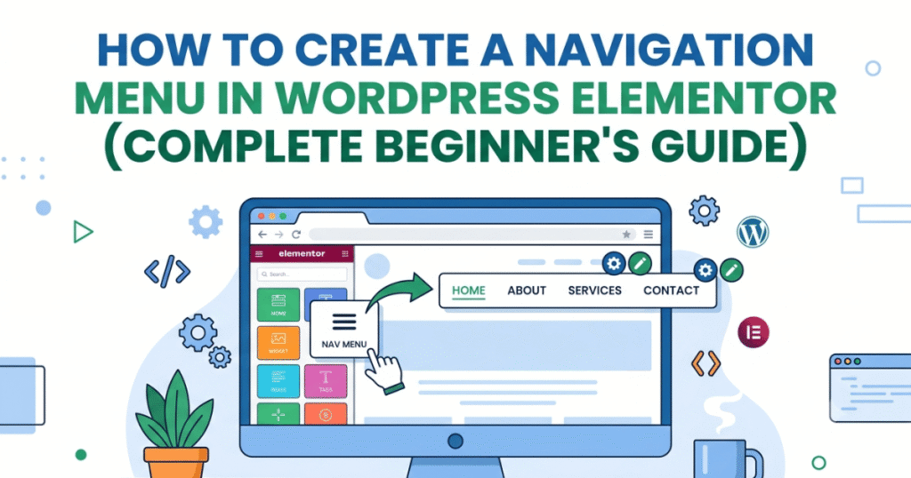
How to Create a Navigation Menu in WordPress Elementor (2026 Guide)
Learn how to create a responsive navigation menu in WordPress Elementor. Follow this beginner-friendly step-by-step guide to build a professional website menu without coding.
Why Your Website Needs a Good Navigation Menu
Before creating your menu, it’s important to understand why navigation matters.
A properly organized menu helps visitors:
- Find pages quickly
- Navigate your website with ease
- Improve overall browsing experience
- Increase engagement and page views
- Support better search engine crawling
A confusing or cluttered menu can cause visitors to leave your website sooner, increasing bounce rates.

Step 1: Create Your Website Pages
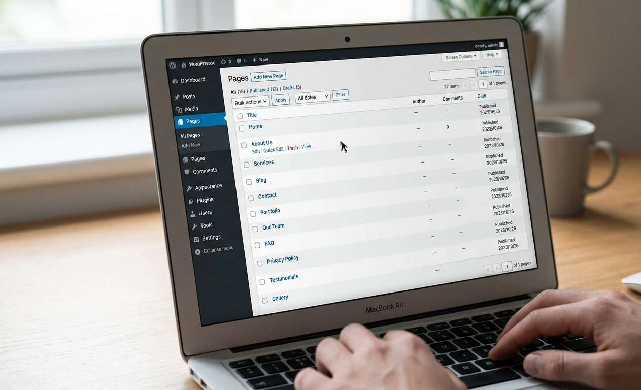
Before building your navigation menu, make sure you’ve created the pages you want visitors to access.
Common pages include:
- Home
- About Us
- Services
- Portfolio
- Blog
- Contact Us
To create a page:
- Log in to your WordPress Dashboard.
- Navigate to Pages > Add New.
- Enter a page title.
- Publish the page.
Repeat this process until all your important pages are ready.
Step 2: Create a Navigation Menu in WordPress
WordPress uses its built-in Menu Manager to organize navigation links.
To create a menu:
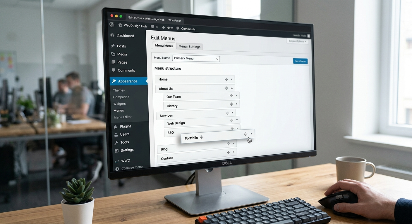
- Go to Appearance > Menus.
- Click Create a New Menu.
- Enter a menu name.
- Select the pages you want to include.
- Arrange the pages by dragging and dropping.
- Save your menu.
You can also create dropdown menus by dragging one menu item slightly beneath another.
This helps organize larger websites without overcrowding the navigation bar.
Step 3: Add the Menu to Elementor
Once your WordPress menu is created, you can display it using Elementor.
If You’re Using Elementor Pro
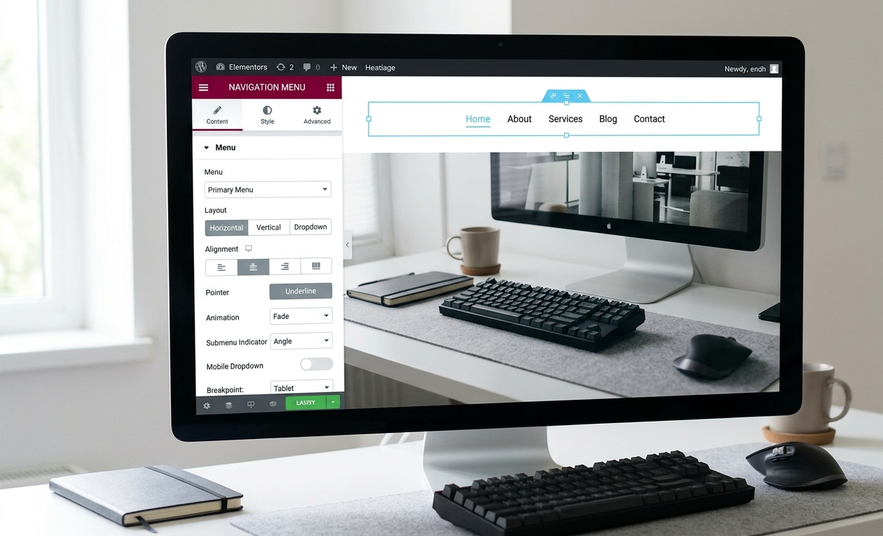
Elementor Pro includes the Navigation Menu widget, allowing you to:
- Display your WordPress menu
- Customize typography
- Change colors
- Adjust spacing
- Create responsive mobile menus
- Add dropdown animations
Simply:
- Edit your Header template.
- Drag the Navigation Menu widget into your layout.
- Choose the menu you created.
- Customize the design.
Everything updates visually in real time.
Step 4: Customize Your Menu Design
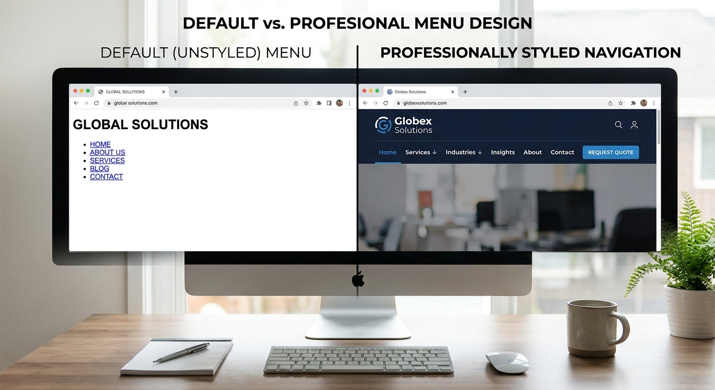
Your navigation should match your website’s branding.
Consider customizing:
1. Typography
Choose fonts that are easy to read and consistent with your brand identity.
2. Colors
Use colors that provide enough contrast for readability while matching your site’s overall design.
3. Spacing
Leave enough space between menu items to improve usability, especially on touch devices.
4. Hover Effects
Simple hover animations can make navigation feel more interactive without becoming distracting.
5. Sticky Header
Many modern websites use a sticky header so the navigation remains visible while users scroll.
Step 5: Optimize for Mobile Devices
More than half of website visitors browse using smartphones.
Your navigation should work smoothly on all screen sizes.
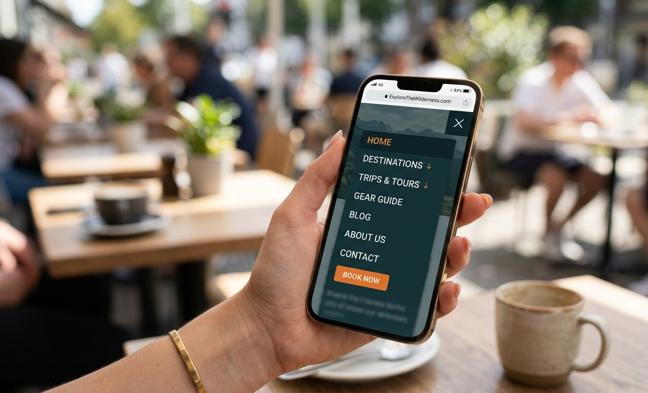
A responsive mobile menu should:
- Collapse into a hamburger icon
- Be easy to tap
- Open quickly
- Display clear navigation labels
- Avoid overcrowding
Always preview your menu on desktop, tablet, and mobile before publishing.
Best Practices for Navigation Menus
A simple menu is usually more effective than one with too many options.
Keep these tips in mind:
- Limit the number of top-level menu items.
- Use clear and descriptive page names.
- Group related pages into dropdown menus.
- Place the most important pages first.
- Keep navigation consistent across the entire website.
- Ensure menus are accessible on all devices.
These practices improve usability and create a more professional browsing experience.
Common Mistakes to Avoid
Avoid these common navigation issues:
1. Too Many Menu Items
An overloaded menu can overwhelm visitors and make navigation difficult.
2. Unclear Labels
Avoid vague labels such as “Stuff” or “Resources.” Instead, use descriptive titles like “Services” or “Pricing.”
3. Ignoring Mobile Users
Always check that your menu functions correctly on smaller screens.
4. Inconsistent Navigation
Changing menu layouts across different pages can confuse users.
Elementor Free vs Elementor Pro
| Feature | Elementor Free | Elementor Pro |
|---|---|---|
| Basic Page Builder | ✅ | ✅ |
| Navigation Menu Widget | ❌ | ✅ |
| Header Builder | ❌ | ✅ |
| Sticky Header | Limited | ✅ |
| Responsive Controls | Basic | Advanced |
| Theme Builder | ❌ | ✅ |
If you need complete control over your website header and navigation, Elementor Pro offers significantly more flexibility.
Frequently Asked Questions
1. Can I create a menu without Elementor Pro?
Yes. WordPress allows you to create menus using its built-in menu system. However, Elementor Pro provides additional customization through the Navigation Menu widget.
2. Can I add dropdown menus?
Yes. WordPress supports multi-level dropdown menus that work seamlessly with Elementor.
3. How do I make my menu mobile-friendly?
Use Elementor’s responsive settings to configure the mobile menu, test it on different devices, and ensure navigation remains easy to use.
4. Should every page appear in the menu?
Not necessarily. Include only the pages that are important for visitors to access quickly.
Conclusion
A clear and responsive navigation menu plays a major role in improving website usability and visitor engagement. By combining WordPress’s built-in menu management with Elementor’s design flexibility, you can create a professional navigation experience that looks great on every device.
Take time to organize your pages, keep your menu simple, and regularly test its performance. A well-structured navigation system not only enhances user experience but also supports better search engine optimization and overall website success.