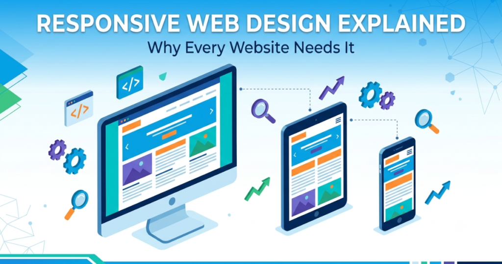
Today, people browse websites on smartphones, tablets, laptops, and desktop computers. Because of this, your website must be able to adapt to different screen sizes while providing an excellent user experience. This is where responsive web design becomes essential.
A responsive website automatically adjusts its layout, images, text, and navigation to fit any device, ensuring visitors can browse comfortably without zooming or excessive scrolling.
In this guide, you’ll learn what responsive web design is, why it matters, and how it can benefit your business.
What Is Responsive Web Design?
Responsive web design is a web development approach that allows a website to automatically adjust its layout based on the visitor’s screen size.
Instead of creating separate websites for desktop and mobile devices, one responsive website works across all devices.
Whether someone visits your website using a phone, tablet, laptop, or desktop computer, they’ll enjoy a consistent browsing experience.
Why Is Responsive Design Important?
Modern users expect websites to load quickly and display correctly on every device. If a website is difficult to navigate on mobile, visitors are more likely to leave and look elsewhere.
Google also prioritizes mobile-friendly websites in its search results, making responsive design an important factor for SEO.
Responsive vs Non-Responsive Website
| Responsive Website | Non-Responsive Website |
|---|---|
| Works on all screen sizes | Designed mainly for desktop |
| Mobile-friendly navigation | Difficult to use on phones |
| Better user experience | Visitors often leave quickly |
| Improved SEO performance | Lower search engine rankings |
| Easier maintenance | Multiple layouts may be needed |
Key Benefits of Responsive Web Design
A responsive website offers several advantages for both businesses and visitors.
1. Better User Experience
Visitors can easily read content, navigate menus, and interact with your website without constantly zooming or scrolling.
2. Improved SEO
Search engines prefer websites that provide a great mobile experience, helping responsive websites achieve better visibility in search results.
3. Faster Website Management
Instead of maintaining separate desktop and mobile websites, you only need to update one responsive website.
4. Increased Conversion Rates
When visitors have a smooth browsing experience, they’re more likely to contact your business, request a quote, or complete a purchase.
5. Future-Proof Design
Responsive websites are built to adapt to new devices and different screen sizes as technology continues to evolve.
Common Responsive Design Mistakes
| Mistake | Better Solution |
| Tiny text on mobile | Use readable font sizes. |
| Buttons too close together | Leave enough spacing for easy tapping. |
| Large images slowing the website | Optimize images before uploading. |
| Fixed-width layouts | Use flexible layouts that adjust automatically. |
| Ignoring tablet layouts | Test your website on multiple devices. |
Best Practices
To create a truly responsive website, follow these recommendations:
- Design with mobile users in mind.
- Optimize all images for faster loading.
- Use responsive typography.
- Test your website on desktop, tablet, and mobile devices.
- Keep navigation simple and easy to use.
- Avoid overcrowding pages with unnecessary content.
How Elementor Helps Build Responsive Websites
Elementor includes built-in responsive editing tools that allow you to customize layouts for desktop, tablet, and mobile devices without writing code.
You can adjust spacing, typography, image sizes, and even hide or display specific elements depending on the screen size. This makes it easy to create a professional-looking website that performs well across all devices.
Frequently Asked Questions
1. What is responsive web design?
Responsive web design is a design approach that allows a website to automatically adjust its layout and content to fit different screen sizes, including smartphones, tablets, laptops, and desktop computers.
2. Why is responsive design important for SEO?
Google prioritizes mobile-friendly websites because they provide a better user experience. A responsive website can improve search rankings and increase organic traffic.
3. Does Elementor support responsive design?
Yes. Elementor includes responsive editing tools that let you customize layouts, fonts, spacing, and images separately for desktop, tablet, and mobile devices.
4. How can I check if my website is responsive?
You can resize your browser window, use your browser’s device preview tools, or test your website on different devices to ensure it displays correctly.
5. Can an existing website be made responsive?
Yes. Most websites can be updated with responsive layouts, optimized images, and mobile-friendly design improvements without needing to rebuild everything from scratch.
Final Thoughts
Responsive web design is no longer optional—it’s an essential part of every modern website. A responsive website improves user experience, supports better SEO, increases conversions, and ensures your content looks great on every device.
Whether you’re creating a new website or redesigning an existing one, investing in responsive design helps future-proof your online presence and provides visitors with the best possible browsing experience.