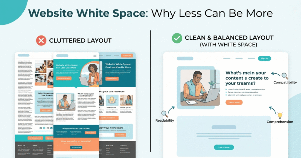
When designing a website, it’s easy to assume that every part of the page should be filled with text, images, and buttons. However, one of the most powerful design techniques is knowing when not to add more.
White space, also known as negative space, is the empty area between elements on a webpage. It doesn’t have to be white—it simply refers to the unused space that helps organize content and improve readability.
A well-balanced layout with sufficient white space creates a cleaner, more professional appearance while making it easier for visitors to focus on what matters most.
In this guide, you’ll learn what white space is, why it’s important, and how to use it effectively in modern web design.
What Is White Space?
White space is the empty area between design elements such as:
- Text
- Images
- Buttons
- Icons
- Sections
- Columns
- Margins
- Padding
Although it may appear “empty,” white space serves an important purpose by giving content room to breathe.
It helps visitors scan information more comfortably without feeling overwhelmed.
Why Is White Space Important?
White space improves both the visual appearance and usability of a website.
Benefits include:
- Makes content easier to read.
- Creates a clean, modern design.
- Draws attention to important elements.
- Improves user experience.
- Enhances visual hierarchy.
- Reduces clutter.
- Makes websites feel more professional.
- Can improve conversion rates by highlighting calls-to-action.
Rather than wasting space, white space helps visitors focus on the content that matters most.
Types of White Space
1. Macro White Space
Macro white space refers to the larger empty areas between major sections of a webpage.
Examples include:
- Space between content sections
- Margins around the page
- Distance between columns
- Padding around hero sections
Macro white space helps organize the overall layout.
2. Micro White Space
Micro white space refers to the smaller spaces between individual elements.
Examples include:
- Line spacing
- Letter spacing
- Space between paragraphs
- Padding inside buttons
- Space between icons and text
These small details improve readability and usability.
Benefits of Using White Space
Better Readability
Proper spacing between headings, paragraphs, and images makes content easier to read and understand.
Improved User Experience
Visitors can scan pages more quickly when content isn’t overcrowded.
A clean layout reduces frustration and helps users find information faster.
Stronger Visual Hierarchy
White space naturally guides visitors’ attention toward important elements such as:
- Headlines
- Call-to-action buttons
- Images
- Key messages
It creates a clear path for users to follow.
Professional Appearance
Many premium websites use generous white space to create a modern and sophisticated design.
Minimalist layouts often feel more trustworthy and easier to navigate.
Higher Conversion Potential
Giving important buttons and forms room to stand out can increase the likelihood that visitors will interact with them.
Sometimes removing unnecessary elements is more effective than adding new ones.
Good vs Poor Use of White Space
| Good Design | Poor Design |
|---|---|
| Comfortable spacing | Crowded layout |
| Easy-to-read content | Large blocks of text |
| Clear visual hierarchy | Everything competes for attention |
| Balanced sections | Elements placed too close together |
| Focus on important content | Too many distractions |
Common White Space Mistakes
| Mistake | Better Solution |
|---|---|
| Filling every area with content | Leave breathing room between sections. |
| Large blocks of text | Break content into shorter paragraphs. |
| Buttons too close together | Add spacing to improve usability. |
| No padding inside containers | Use consistent padding and margins. |
| Inconsistent spacing | Maintain a consistent spacing system throughout the website. |
Best Practices
To use white space effectively:
- Prioritize clarity over quantity.
- Use consistent margins and padding.
- Break long paragraphs into shorter sections.
- Leave space around important buttons.
- Maintain balanced spacing between headings and content.
- Avoid overcrowding pages with unnecessary elements.
- Test your layouts on desktop, tablet, and mobile devices.
- Remember that empty space is part of the design.
How Elementor Helps Manage White Space
Elementor gives you precise control over spacing without writing code.
With Elementor, you can:
- Adjust margins and padding.
- Control spacing between widgets.
- Create responsive layouts.
- Use containers to organize content.
- Fine-tune section spacing for different screen sizes.
These tools make it easier to create clean, balanced, and professional website layouts.
Examples of Effective White Space
Many well-designed websites use white space strategically to improve readability and focus.
For example:
- A landing page with a single headline, short description, and one call-to-action button surrounded by generous spacing.
- A product page where each section is separated clearly, allowing visitors to focus on images and key information.
- A blog article with comfortable line spacing and margins that make long-form content easier to read.
These layouts feel more inviting because they avoid visual clutter.
Frequently Asked Questions (FAQ)
1. What is white space in web design?
White space, also known as negative space, is the empty area between elements such as text, images, buttons, and sections. It helps improve readability and creates a cleaner layout.
2. Does white space have to be white?
No. White space refers to unused space in a design, regardless of its background color. It can be any color or even a background image.
3. Why is white space important?
White space improves readability, highlights important content, reduces visual clutter, and creates a more professional and user-friendly website.
4. Can too much white space be a problem?
Yes. While white space is valuable, excessive spacing can make content feel disconnected or require unnecessary scrolling. The goal is to achieve a balanced layout.
5. How can Elementor help with white space?
Elementor allows you to adjust margins, padding, container spacing, and responsive layouts, making it easy to create balanced designs with effective use of white space.
Final Thoughts
White space is one of the most effective tools in web design, even though it often goes unnoticed. By giving content room to breathe, white space improves readability, strengthens visual hierarchy, and creates a more professional user experience.
Instead of trying to fill every empty area, focus on creating balance. A clean layout with thoughtful spacing helps visitors navigate your website more easily and encourages them to engage with your content.
Remember, great design isn’t about adding more—it’s about knowing what to leave out.