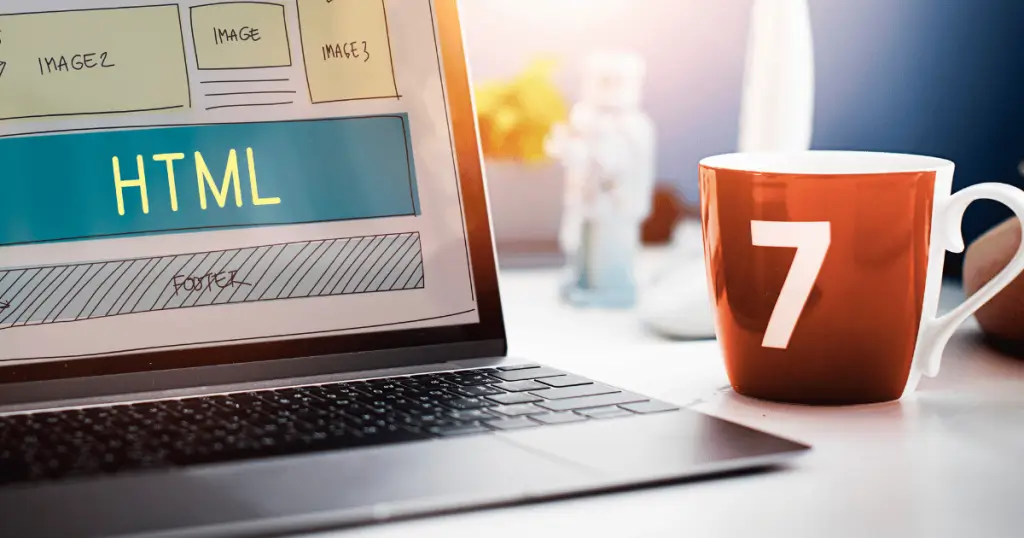
Your Website Doesn’t Need a Rebuild — It Needs a Makeover
Most business owners think they need a full website redesign to increase sales.
But in reality, the fastest growth often comes from small, strategic design improvements that dramatically improve how customers engage, trust, and buy.
Modern consumers judge your business within seconds.
A confusing layout, weak colours, or poorly placed call-to-action buttons can silently destroy your conversions.
The good news? You don’t need to tear everything down.
A targeted digital makeover can help you increase sales — sometimes by 2x, even 3x — without rebuilding your entire site.
Here are the high-impact design changes that Malaysian businesses are using in 2025 to turn average websites into powerful sales machines.
1. Improve Your Above-the-Fold Area
When someone lands on your website, the first screen they see determines whether they stay or leave.
Most sites fail here because:
- The headline is unclear
- The value is not obvious
- The CTA is missing or hidden
- The layout is cluttered
A strong above-the-fold area includes:
- A clear headline stating what you offer
- A subheading explaining the value
- A strong CTA (e.g., “Get a Quote,” “Book a Consultation”)
- Supporting visual or service preview
If your visitor can’t understand your business in 5 seconds, your sales will suffer.
2. Use High-Contrast, High-Visibility CTAs
Your call-to-action buttons must stand out visually.
Small, muted, or weakly coloured buttons get ignored.
Strong CTAs:
- Use contrasting colours
- Have clear wording
- Appear throughout the page
- Are positioned where decisions are made
Changing CTA colour or wording alone can boost conversions instantly.
Examples of strong CTAs:
- “Get My Free Quote”
- “Claim Your Consultation”
- “Request Proposal”
Clarity leads to action.
3. Simplify Your Navigation
Visitors won’t search for what they need — they’ll leave.
A cluttered or confusing menu kills conversions.
Your navigation should:
- Be simple and logical
- Use 5–7 main menu items
- Include clear service categories
- Keep important links visible at all times
Simplifying navigation reduces friction and increases user confidence.
4. Strengthen Your Visual Hierarchy
Your design must guide the user’s eyes, not overwhelm them.
Use hierarchy techniques:
- Larger headings
- Consistent spacing
- Bold key points
- Clean visual structure
- Clear section breaks
A good layout persuades subconsciously — even before users read the text.
5. Add More Social Proof
Strong branding design and social proof work together to build trust.
Adding the following can increase conversions by up to 40%:
- Testimonials
- Case studies
- Client logos
- Certifications
- Awards
- Screenshots of messages or reviews
The more trust signals you show, the more confident your visitor feels buying from you.
6. Reduce Text, Increase Clarity
Too many websites drown visitors in text.
People don’t read paragraphs — they scan.
Replace blocks of text with:
- Short paragraphs
- Bullet points
- Visual icons
- Clear statements
The easier it is to understand your offer, the faster people act.
7. Improve Mobile Layout and Responsiveness
A website that looks good on desktop but terrible on mobile is losing 70% of its potential sales.
This includes:
- Buttons that are too small
- Text that is unreadable
- Images that break
- Layouts that shift
- Slow loading times
Mobile-first design is mandatory in 2025 for strong conversions and SEO Marketing.
8. Increase Page Speed
Slow websites kill conversions, lower rankings, and frustrate visitors.
Simple improvements can double your speed:
- Compress images
- Minimise scripts
- Remove heavy animations
- Use caching
- Upgrade hosting
A fast site converts better because users stay longer and take action.
9. Improve Your Product or Service Presentation
Whether you sell services or products, presentation matters.
Small improvements include:
- Better product photos
- Cleaner service icons
- Before/after visuals
- Clearer pricing options
- Comparison sections
Visual clarity increases perceived value — and perceived value increases sales.
10. Add Strategic Micro-Interactions
Micro-interactions are small animations or hover effects that guide a user’s attention.
Examples:
- Buttons that respond when hovered
- Progress bars
- Hover reveals
- Smooth transitions
These small details make your website feel premium, professional, and trustworthy — which improves conversions.
Final Thoughts
You don’t need a full overhaul to increase sales.
You need small, strategic design improvements that create clarity, trust, and ease.
A digital makeover can:
- Accelerate conversions
- Improve user experience
- Strengthen branding
- Support SEO
- Boost revenue
- Reduce drop-offs
In 2025, the brands that win online are those that optimise continuously — not those that redesign once every five years.
Your website doesn’t need to be rebuilt.
It needs to be refined.

